San Antonio, TX
United States
Where we live plays a role in how long we live, and average life expectancy in Bexar County’s longest-lived neighborhoods is 18 years higher than in its shortest-lived neighborhoods. In partnership with The Health Collaborative and The University of Texas Health Science Center at Houston (UTHealth) School of Public Health in San Antonio, Community Information Now (CI:Now) created the Somos Neighbors interactive website to shine a light on that disparity, show how local neighborhoods are both alike and different, and help community residents unite as neighbors to close that 18-year gap. “Somos” is Spanish for “we are”.
HOW THEY USED 500 CITIES DATA
Community Information Now worked with the U.S. Small-Area Life Expectancy Project (USALEEP) to produce the SomosNeighbors.com website- “Somos” is Spanish for “we are”. When a visitor to the website plugs in their address or neighborhood, an algorithm matches their census tract with another Bexar County census tract that has a very different average life expectancy but is similar on a number of indicators that correlate with life expectancy, weakly or not at all. The “match neighborhood” is not identified for the user so that positive and negative assumptions and biases about different neighborhoods cannot come into play.
The site shows what the two neighborhoods have in common, as well as resident-contributed photos of each neighborhood. The user then sees the difference in life expectancy. That clear disparity is followed by a set of indicators with a medium-to-strong correlation with life expectancy, along with a brief statement that the indicators relate to life expectancy in some way but do not necessarily cause longer or shorter life expectancy. Community Information Now utilizes life expectancy data from USALEEP. Finally, the user is presented with a curated set of links that connect the user with knowledge and opportunities to act to change harmful neighborhood conditions and inequitable health outcomes. Each census tract has five “match neighborhoods”, so the user can explore all five matches, enter a different neighborhood for themselves, or move to a separate “advanced” page.
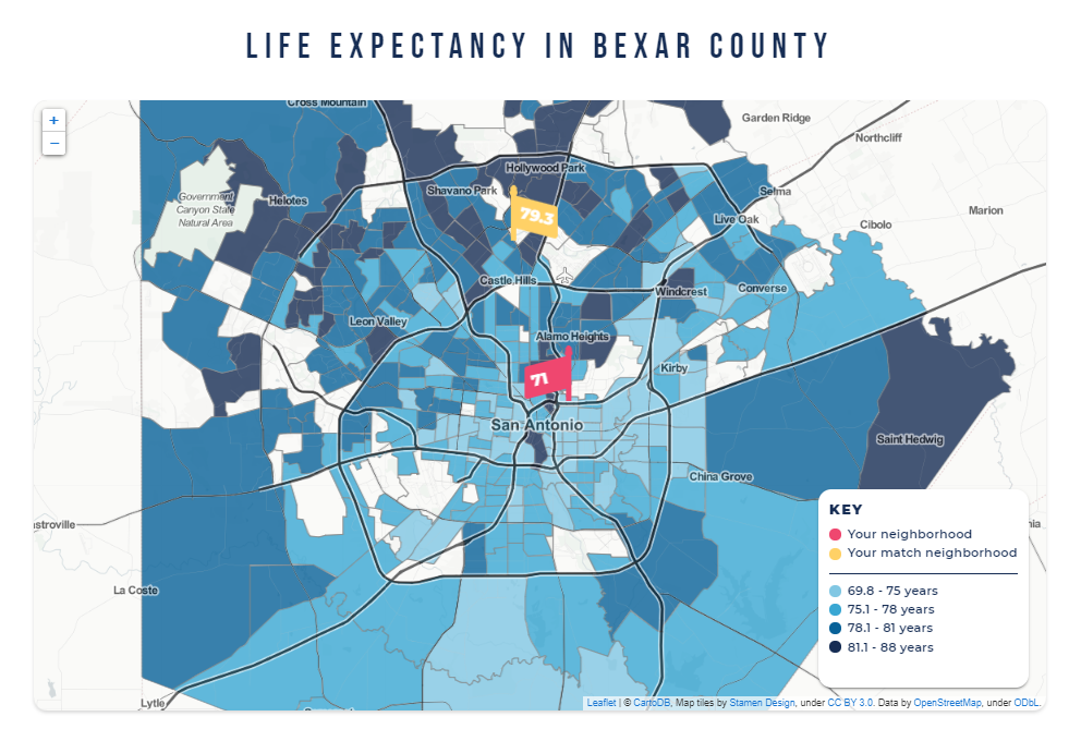
That page offers tools and resources for people interested in a deeper dive into the data. The user can explore average life expectancy across the entire county in a thematic map . An interactive scatterplot tool allows the user to relate average life expectancy with the roughly 45 indicators used in the main page, and in the future, close to 100 indicators total. Site users can also download the dataset itself and a data dictionary that includes source and a longer description of what each indicator measures, among other fields. Although published by about a dozen different sources, all data are publicly available and should be available for any larger city, county, or region in the U.S.
Partners at the Virginia Commonwealth University Department of Biostatistics performed Weighted-Quantile Summation regression (WQS) at both the state and regional level. WQS regression identified the level of correlation and assigned weights to each of the HOI indicators. These weights rank the relative influence of each indicator on life expectancy and allow estimates that changes in these indicators may have on life expectancy.
The visualization identifies the five HOI indicators expected to have the most impact on life expectancy regionally. Using interactive sliders, users can explore the expected effect changes in these indicators may have on LEB in their communities. The visualization includes a list of organizations and evidence-based practices to address each SDOH factor, while an interactive map allows users to identify the census tracts where interventions are needed most.
WHAT THEY LEARNED
Community Information Now identify that it is both challenging and critical to make sure that regardless of technical knowledge about statistics, all users have a basic understanding that:
- The data are at the level of neighborhood/census tract, not the individual person; and
- Correlation with life expectancy does not necessarily mean causation.
CI:Now reviewed the correlated data carefully and removed a handful of indicators with a medium-to-strong correlation that were likely to confuse or outright mislead anyone but a health expert. One example is percent of adult population that binge drinks, which is strongly positively correlated with life expectancy. The reason for the strong correlation is that the census tracts with longer life expectancy are disproportionately populated by white people, who are more likely than other racial/ethnic groups to binge drink and to enjoy protective factors associated with longer life expectancy, including higher incomes, higher education levels, lower exposure to neighborhood violent crime, and better access to preventive health care.
Counterintuitive relationships like this likely would have disappeared had CI:Now elected to use a multivariate analysis, but that choice was deliberate: the goal of the project was to show how the characteristics of neighborhoods with longer and shorter life expectancies are systematically different, not to attempt to quantify the isolated individual effect of each indicator on life expectancy. In the end, the binge drinking example became a way to clarify and strengthen the message by showing in community presentations and discussions how inequities create a world where some groups can “get away with” risky behaviors but others cannot.
Another challenge was ensuring that all narrative on the website and in project promotional materials was readable in both English and the particular Spanish dialect typically spoken in south central Texas. While never easy, the goal of a 6th to 8th grade reading level is much harder to achieve when the core messages involve technical concepts like average life expectancy, census tract, correlation, and margin of error. Each English-language version required multiple rounds of revision informed by free online readability calculators. The Spanish-language versions were reviewed for appropriate word choice by multiple people on the project team, and in one case, by the Health Collaborative’s community health workers as well.
WHAT THEY RECOMMEND FOR SIMILAR PROJECTS
Community Information Now has identified a few recommendations for organizations interested in conducting similar projects centering in the USALEEP data, outlined below:
- Carefully consider approach to matching neighborhoods– folding the map, creating an algorithm completely unrelated to grid, or something in between. It is unlikely that there is a single best or correct approach across all communities. Part of the inspiration for CI:Now’s work was Tonika Lewis Johnson’s Folded Map project in Chicago, which matches corresponding addresses on the street grid. Because San Antonio and other Bexar County municipalities are not laid out on a grid, the team had to create a way to match census tracts. That work required a number of decisions like minimum required physical distance and minimum required number of years of difference in life expectancy between two match neighborhoods. CI:Now’s approach also meant researching, testing, selecting, and employing statistical methods to match tracts, select the neutral indicators to show neighborhood similarities, and select the indicators of neighborhood difference with a medium-to-strong correlation with life expectancy.
- Reduce the need to make time-consuming changes later, by determining data structure early in the planning process. This is critical for projects wanting to display a combination of indicators from categorical to numerical. CI:Now found it very helpful to agree with the web developer on a data format and structure very early in the process. CI:Now was then able to format data files per the web developer’s requirements, which greatly facilitated changes and updates to the data. The same is true for indicators: investing time early in the planning process to set the criteria for the selection and display of indicators creates the needed foundation for all data cleaning, processing, and analysis.
- More information and lessons learned related to technical issues such as the match algorithm, data processing and geocoding, mapping, and choice of open source technologies can be found in the Somos Neighbors Toolkit.
To learn more, follow @CINow on Twitter. If you are interested in learning more about this team’s project approach or have specific questions regarding replicating their work in your community, please feel free to contact the Principal Investigator of this project, Laura McKieran.
